When you’re just starting to build an online brand, it can feel like you’re stuck between two bad options: spend money you don’t really have on design and branding—or throw something together that looks plain, mismatched, or “DIY in a bad way.”
The truth is, you can build a clean, professional-looking brand using mostly free resources for branding, as long as you use them with a plan.
Free fonts. Free stock photos. Free icons. Free templates. Free color palettes. Free logo makers. On their own, they’re just tools. But when you combine them with a simple branding strategy, they can help you look polished, trustworthy, and consistent—even on a tight budget.
In this guide, you’ll learn:
- What “branding” really means (beyond just a logo)
- What kinds of free branding resources are actually worth using
- How to put those resources together into a simple, solid brand system
- A step-by-step process for building your visual brand using free tools
- Common mistakes to avoid so your brand doesn’t look messy or generic
What “Branding” Really Means (Plain-English Version)
Before you start downloading templates and fonts, it helps to understand what you’re actually trying to build.
Branding is not just:
- A logo
- A color
- A font
Branding is the overall feeling people have when they come across your content, offers, or name. It’s the visual and verbal “personality” of your online presence.
Your brand shows up in:
- Your logo and profile images
- The colors and fonts on your website and graphics
- The style of your thumbnails and featured images
- The tone of your writing and headlines
- The way you format tutorials, guides, and reviews
Free resources don’t give you a brand by themselves—but they can help you express your brand consistently if you use them smartly.
Types of Free Resources You Can Use for Branding
There are many different kinds of free branding resources. You don’t need all of them, but it helps to know what’s available.
1. Free Color Palette Generators
Color is one of the fastest ways to create a recognizable brand.
Free color tools help you:
- Generate palettes based on a starting color
- Explore trending palettes
- Pick colors that work well together
- Export hex codes for use in your website and graphics
You can choose:
- A main brand color (for buttons, highlights, key sections)
- 1–2 secondary colors (for backgrounds or accents)
- Neutral colors (white, off-white, light gray, dark gray, near-black)
2. Free Fonts and Typography Pairing Tools
Fonts shape how your brand feels—modern, classic, playful, serious, etc.
Free font resources help you:
- Browse fonts by style
- Preview font pairings (heading + body)
- Download or embed fonts for your site and graphics
A simple approach:
- One font for headings (bold, clear, easy to read)
- One font for body text (simple, readable at small sizes)
That’s enough for most beginner brands.
3. Free Logo and Icon Generators
You don’t need a complicated logo to start. In many cases, a simple text logo or monogram is more than enough.
Free logo/icon tools can help you:
- Generate simple wordmarks (brand name in a nice font)
- Create letter-based or symbol-based marks
- Export basic logo files you can use on your site and social profiles
Even if you plan to hire a designer later, a clean temporary logo is fine for your first version.
4. Free Stock Photos and Illustrations
Visuals help your brand feel alive and relatable. Free image libraries offer:
- Photos (real people, objects, workspaces, etc.)
- Illustrations (flat, 3D, minimal, etc.)
- Vectors (scalable graphics you can edit)
You can use them for:
- Blog featured images
- Social media posts
- Backgrounds for quotes and tips
- Headers for landing pages
Try to pick images that share a similar style, tone, and color so your brand doesn’t look random.
5. Free Social Media and Banner Templates
Many design tools offer ready-made templates for:
- YouTube thumbnails
- Facebook, Instagram, and LinkedIn posts
- Pinterest pins
- Blog headers and hero sections
You can swap in your:
- Colors
- Fonts
- Logo
- Text and images
These templates are great for beginners because they give you a head start on layout and spacing, which are easy to mess up when you’re new to design.
6. Free Icon Packs and UI Elements
Icons are the little visuals you see on:
- Feature lists
- Buttons
- Bullet sections
- Pricing tables
Free icon packs give you a consistent set of icons you can reuse across your site and graphics, which makes your brand feel unified and intentional.
7. Free Mockup Templates
Mockups let you showcase:
- Ebooks
- Checklists
- Courses
- Software dashboards
- Mobile apps
Free mockup tools and templates can make your offers look more tangible and professional, even if they’re digital.
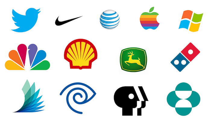
How to Use Free Resources Without Making Your Brand Look Generic
Just because something is free doesn’t mean it has to look cheap. The real risk isn’t the resource itself—it’s using it without a plan.
Here’s how to use free resources in a way that still feels unique and professional.
1. Pick a Direction Before You Pick Tools
Instead of starting with “Which template looks cool?”, start with:
- Who is my audience?
- How do I want my brand to feel? (e.g., modern, friendly, bold, calm)
- What kind of content am I creating? (reviews, tutorials, guides, etc.)
For example, your brand might be:
- Modern and techy (good for AI tools and software content)
- Clean and professional (good for business and productivity tools)
- Friendly and approachable (good for beginner guides and tutorials)
Use that feeling to guide your:
- Colors (bold or muted)
- Fonts (sharp or rounded)
- Imagery (abstract tech vs real-life workspaces)
2. Limit Your Choices (On Purpose)
One of the biggest mistakes beginners make is using everything:
- Too many colors
- Too many fonts
- Random images from different styles
Instead, set clear limits:
- 1 primary color + 1–2 accent colors + neutrals
- 1 heading font + 1 body font
- 1 main image style (photos or illustrations, not both mixed chaotically)
These limits actually make designing easier and more cohesive.
3. Customize Templates So They Look Like You
Templates are a starting point, not a final product. When you use a free template:
- Change the colors to your brand colors
- Swap fonts to your chosen brand fonts
- Replace all placeholder images with your chosen image style
- Update shapes and elements to feel consistent across templates
If you use templates “out of the box” with no changes, your brand can end up looking like everyone else’s.
4. Reuse Elements Across Platforms
Once you’ve decided:
- Colors
- Fonts
- Logo style
- Image style
Use them everywhere:
- Website
- YouTube thumbnails
- Social posts
- Lead magnets
- Email headers
This repetition is what trains people to recognize your brand—long before they remember your actual domain name.
Step-by-Step: Build a Simple Brand Using Free Resources
You don’t need a full “brand book” to get started. Here’s a simple, practical sequence anyone can follow.
Step 1: Choose Your Brand Colors
- Visit a free color palette generator.
- Start with one base color that matches your niche:
- Tech and AI: blues, purples, teals
- Money and business: greens, blues, dark neutrals
- Let the tool suggest 3–5 matching colors.
- Pick:
- 1 main brand color
- 1 accent color
- Neutrals (light background, dark text)
Write down the hex codes somewhere you can easily access them.
Step 2: Choose Two Fonts
Visit a free font library or pairing tool and choose:
- A heading font: clear, bold, easy to read at large sizes
- A body font: simple, comfortable for long paragraphs
Test them together in a mock blog header to make sure they:
- Are readable on desktop and mobile
- Match the feeling you want (serious vs playful, modern vs classic)
Note your chosen fonts and how you’ll use them (e.g., headings, paragraphs, buttons).
Step 3: Create a Simple Logo
Using a free design tool:
- Create a new canvas (horizontal layout for website use).
- Type your brand name using your heading font.
- Use your main brand color as an accent (text or underline).
- Keep it clean—no need for complex icons.
Export:
- A main logo (for website header)
- A square or circle version (for profile pictures and favicons)
You now have a basic but consistent logo system.
Step 4: Define Your Image Style
Decide whether you’ll lean toward:
- Real photography (office scenes, people working, devices)
- Illustrations (flat, colorful, techy vectors)
Then:
- Save a small library of 15–30 images that match your style
- Use them for website headings, blog posts, and social graphics
Try to stick to:
- Similar lighting and mood
- Similar color tones (so they don’t clash with your brand colors)
Step 5: Build Reusable Social and Blog Templates
In your free design tool, create:
- A blog post featured image template (with your colors, fonts, logo)
- A YouTube thumbnail or featured graphic template
- A basic social post template for quotes, tips, or headlines
Save them as master templates so you can duplicate and update them quickly for new content.
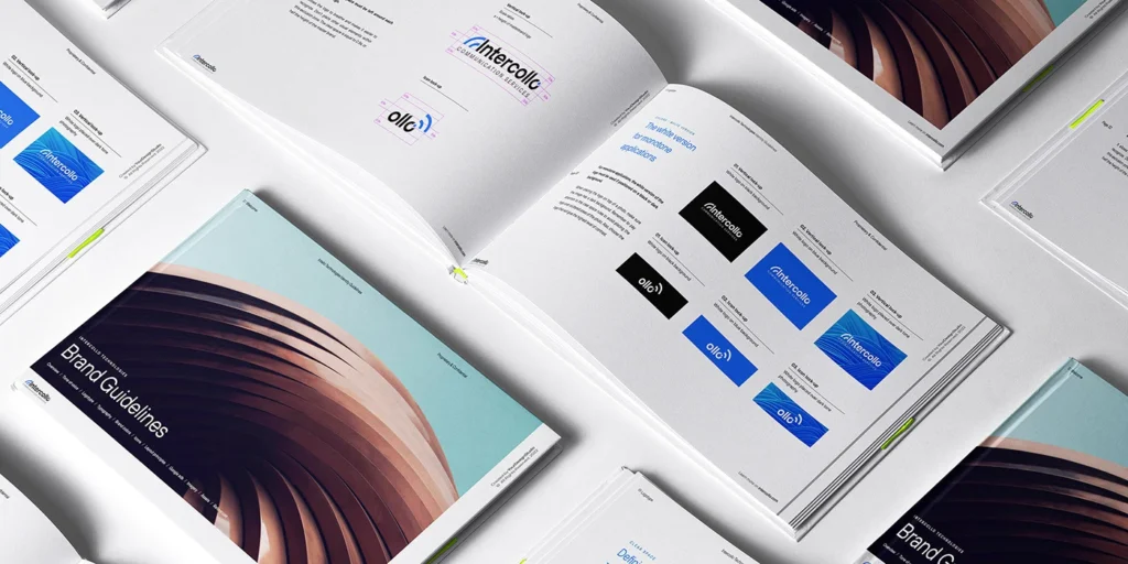
Step 6: Create a Simple Brand Sheet
Make a one-page “brand cheat sheet” that includes:
- Logo versions
- Color swatches + hex codes
- Font names and usage
- Image examples
- A few sample graphics
You can keep this in:
- A PDF
- A Notion/Docs page
- A design file
Any time you create something new (blog graphic, landing page, email header), refer to this sheet.
Practical Ways to Use Free Resources for Branding (Daily + Weekly)
Once you have your basic brand system, here’s how you actually use it in your day-to-day content.
For Blog Posts and Articles
- Use the same featured image template for every post.
- Stick to your brand fonts for headings and text.
- Use your brand colors for buttons, links, and highlights.
- Choose on-brand stock photos for in-article visuals.
For YouTube and Video Content
- Use one thumbnail style across all videos:
- Same font
- Same color scheme
- Similar layout
- Use your logo or initials in a corner.
- Use screen-recorder or AI video tools that match your visual language.
For Social Media
- Reuse your social post templates with:
- New headlines
- New tips
- New images
- Use your brand colors for:
- Backgrounds
- Borders
- Text overlays
This makes your content instantly recognizable as people scroll.
For Lead Magnets and Bonuses
If you offer:
- Checklists
- PDFs
- Mini guides
- Bonus resources
Use the same fonts, colors, and design style you’ve already defined. Even simple layouts can look very professional when they’re consistent.
Common Mistakes When Using Free Resources for Branding
1. Mixing Too Many Styles
Using a flat illustration template for one post, a corporate stock photo for the next, and a neon text-only graphic the next can make your brand feel scattered.
Fix: Commit to one visual style and stick with it for a while.
2. Overloading Graphics with Text and Elements
Just because a template has lots of boxes and shapes doesn’t mean you need all of them.
Fix: Keep it simple—one main headline, maybe a subheadline, clean visual.
3. Ignoring Mobile Readability
Fancy fonts that look good on desktop might be unreadable on a phone.
Fix: Preview your designs small and make sure text is still clear.
4. Using Random Colors Not in Your Palette
Grabbing a color at random each time you create a new graphic breaks your brand consistency.
Fix: Only use colors from your defined palette (plus neutral black/white/gray).
5. Never Updating Your Brand Once You Grow
Free resources are perfect for starting—but as your brand grows, you might want:
- A more custom logo
- Refinements to your color and font system
- Unique illustrations or branded photo shoots
That doesn’t mean your initial brand was wrong; it means you’re leveling up. Just make sure any future changes build on the foundation you’ve already created.
Advanced Insight: Layering AI Tools Into Your Branding Workflow
As you get more comfortable with basic free resources, you can layer in AI tools to speed things up:
- Use AI writing tools to:
- Generate headline variations for graphics
- Brainstorm brand taglines and positioning statements
- Use AI image or design tools to:
- Create unique background patterns
- Generate concept art for your niche
You still control the final look, but AI can help you explore more ideas faster.
Conclusion
You don’t need a huge budget, a design degree, or a full creative team to build a brand that looks consistent and trustworthy. By using free resources for branding—color tools, fonts, templates, images, icons, and more—you can create a clean, professional identity for your website, content, and offers.
The key is not to collect random free things, but to:
- Decide how you want your brand to feel
- Choose a small set of colors, fonts, and image styles
- Customize your templates so they look like you
- Reuse those elements across your blog, videos, social posts, and bonuses
Over time, your audience won’t just recognize your logo—they’ll recognize your style, your voice, and the way your brand shows up across everything you publish.
Frequently Asked Questions
Yes. Many successful creators and small businesses start with free tools and assets, then upgrade parts of their brand over time. What matters most is consistency, clarity, and how well your visuals support your message—not how much they cost.
It can—if you don’t customize them. Change colors, fonts, layout emphasis, and imagery to match your own brand decisions. Use templates as a starting structure, not a final design.
For most beginners, a simple structure works best: 1 primary brand color, 1 secondary accent color, and neutral colors (white/cream, light gray, dark gray, near-black). Too many colors can make your brand look chaotic and less professional.
Not at the start. Free tools and templates are usually enough to build a solid first version of your brand. Later, when you’re making consistent income, you can hire a designer to refine your visuals and create more advanced assets.
Create a one-page brand sheet that contains your logo, color palette (with hex codes), fonts and where they’re used, and example graphics. Refer to this sheet whenever you create something new. Over time, it becomes your guide—and a simple onboarding document if you ever bring in a VA or designer.

